Today, I worked on uploading my finished project to blogger. To upload the magazine to my blog was fairly easy. Canva made it very easy to share my project. All I had to do to share my finished magazine was copy a link from Canva and attach it to my blog. I was unaware of how to attach links with different text names on blogger and had to learn how to do this. This only took me a minute though as blogger makes this process very easy. All I had to do was press link and copy the link into the space for the web address and write what I wanted the link to be called in the other blank space.
Uploading my CCRs was a much more difficult process. I began by trying to upload an online presentation of my Power Points to my blog. This did not work, however, because I had to be presenting the Power Point in order for anyone to view it. I then tried to upload my Power Points to one drive and add the link created by this. This did not work because for a one drive link you need access to view it, and I could not make the presentation open to everyone. I then researched tutorials on how to upload Power Points to blogger and I found a YoutTube tutorial that explained how. I had to use the website called Scribda and upload my Power Points there. Scribda then provided me with a link that allowed me to embed my Power Point into my blogs. I had to create a separate blog for each CCR to achieve this.
Tuesday, December 17, 2019

Tuesday, December 10, 2019
Cover Changes
Today I made many changes to my cover to improve the visual appeal. First, I added a bar code to the bottom right corner of my magazine. I put it here because it was an empty space that needed to be filled. I also added this to make my magazine mimic a realistic magazine. I then looked at the same hip hop magazines my group and I researched earlier in the process and began to make revisions based off of these. One thing I realized that was common of magazines was to separate the article titles on the cover in some way. Typically they were either very far apart from each other on the title, or they were physically separated by a barrier. On my magazine, I separated my puffs with white lines in between them. I choose this method because it complimented my cover well and was the most visually appealing option.
I also noticed that many magazines used shapes and other elements as text boxes to put their text in. I mimicked this for my slogan by placing the slogan in an octagon on my cover. This was very visually appealing and made the slogan stand out more. I did something similar with this for the title of my magazine. I placed a black box behind the title on my cover and left the font color as red. I did this because it makes the title stand out even more to the reader. The bright red font on the black background really pops and draws all of the readers attention which is the intention.

I also noticed that many magazines used shapes and other elements as text boxes to put their text in. I mimicked this for my slogan by placing the slogan in an octagon on my cover. This was very visually appealing and made the slogan stand out more. I did something similar with this for the title of my magazine. I placed a black box behind the title on my cover and left the font color as red. I did this because it makes the title stand out even more to the reader. The bright red font on the black background really pops and draws all of the readers attention which is the intention.

My Updated Cover
Monday, December 9, 2019
CCR Planning
Today I began to work on My CCRs and plan what I wanted to do for them. I am not confident using too many platforms so I have decided to use primarily PowerPoint to create my CCRs. We are going to do three CCR questions this week and one at a later date. For the three I am going to do this week I am going to create three Power Points for them. For the one i create at a later date I plan on creating a Presi. For the Power Points I plan on creating very detailed answers to the questions in the form of bullet pointed information. I also plan to include several images as visual aid to help my Power Point with clarity and to make sure everything is very easy to understand. I plan on working on my CCRs the next week or so, so I can complete them on time.
I will also continue to review my final project and make any visual changes that might help to make my magazine more visually appealing. I am now completely finished with my magazine and am only working on making minor revisions. For example, I plan on adding a bar code to my cover page to make it more realistic and look more like a real magazine cover page. I am also trying to make other changes to make my overall magazine possibly more visually appealing. So, for this next week I plan on working on my CCRs as well as making final visual changes to my magazine.
I will also continue to review my final project and make any visual changes that might help to make my magazine more visually appealing. I am now completely finished with my magazine and am only working on making minor revisions. For example, I plan on adding a bar code to my cover page to make it more realistic and look more like a real magazine cover page. I am also trying to make other changes to make my overall magazine possibly more visually appealing. So, for this next week I plan on working on my CCRs as well as making final visual changes to my magazine.
Themes Throughout the Magazine
Throughout the process of making the magazine I tried to reinforce many themes to keep my magazine consistent and to give it a unique style. The first theme I tried to keep throughout y magazine was the bold red font. On my cover page all of the text is very bright red and very bold. This was to grab a readers attention and to make my magazine stand out on a shelf. The goal of the red was also to excite the reader since red is a psychologically exciting color. I used this theme of red in my Contents page, but not in my two page spread. I did not want to include the red theme in my two page spread because I did not want anything specifically to take the readers attention, rather I wanted the reader to view the article as a whole.
Another theme that was reinforced in my magazine was very light text on a dark background. I used this style to make my magazine unique. Most of the hip hop magazines we researched before this project used black text on a white background. What I wanted to do with my magazine was create a very unique style that made it unlike any other hip hop magazines. The inclusion of white text on a black background throughout my whole magazine challenges the classic black text on white background and makes my magazine unique. All of the themes we used in The Come Up were used to create a unique style that would make our magazine very recognizable among consumers. We also created some things due to conventional styles in other hip hop magazines. Red was a very common theme among other hip hop magazines which inspired us to use the red.
Another theme that was reinforced in my magazine was very light text on a dark background. I used this style to make my magazine unique. Most of the hip hop magazines we researched before this project used black text on a white background. What I wanted to do with my magazine was create a very unique style that made it unlike any other hip hop magazines. The inclusion of white text on a black background throughout my whole magazine challenges the classic black text on white background and makes my magazine unique. All of the themes we used in The Come Up were used to create a unique style that would make our magazine very recognizable among consumers. We also created some things due to conventional styles in other hip hop magazines. Red was a very common theme among other hip hop magazines which inspired us to use the red.
Conventions on the Cover
On the cover of my magazine I made many conscious decisions about the conventions I used. One example of this is the anchorage I created on the cover. I related the cover image to the text by including the name of the rapper on the cover in the text. The name is the largest thing on the cover other than the actual title of the magazine. This gave the reader context as to who was on the cover of my magazine since he may have been unfamiliar to many. We also included our slogan on the title page. Our slogan was "The Music Experts" and we placed it right under the cover to entice readers to buy our magazine. The placing was to make it the second thing the readers see after the title so we could establish a sense of trust with the reader.
We placed both the title and the slogan in the masthead at the top of the page. The reason these two things were placed here is because we wanted them to be the first thing the readers saw when they looked at our magazine. This immediately notifies the reader what they are looking at as well as entices them to buy our magazine. The puffs I included on my cover used big nae artists such as J Cole and Kanye West. The reason I included these puffs on the cover is because big rap fans would immediately recognize these names and want to read these articles. This would again entice potential readers to buy my magazine.


Friday, December 6, 2019
Writing my Article
To finish my magazine I had to write the article for my two page spread. Since our magazine was about up and coming rappers we all decided to make our stories about the come ups of the rappers. I wrote mine on the come up story of Matty B the rapper. In my article I wanted the reader to learn not only about the rappers story, but I also wanted them to learn about the rapper as a person. I wrote about the rappers poor upbringings and how he has found success despite this. I used the questions and answers more to learn about the rapper rather than his story. I did this because it was a unique way to show what the rapper was like by showing his voice and opinions. I believed that this was also the best way to show the reader what the rapper was like. It showed them his reaction to certain questions, as well as specific opinions and views on things about his career.
In my article I also wanted to focus on the rappers music. I created fictional songs that the rapper released and focused on the content of them. I wanted a heavy focus of my article to be the meaning of the rappers music. To readers, focusing on the meaning showed them that this rapper was very unique and had his own individual style that did not follow mainstream hip hop music. This further showed the reader what the rapper was like and gave them insight to his music. Focusing on the unique style of his music set the rapper apart from others and explained why he was so popular.
In my article I also wanted to focus on the rappers music. I created fictional songs that the rapper released and focused on the content of them. I wanted a heavy focus of my article to be the meaning of the rappers music. To readers, focusing on the meaning showed them that this rapper was very unique and had his own individual style that did not follow mainstream hip hop music. This further showed the reader what the rapper was like and gave them insight to his music. Focusing on the unique style of his music set the rapper apart from others and explained why he was so popular.
Thursday, December 5, 2019
Interview Questions and Answers
To write my article, I had to first plan my mock question and answer session I would have with my model that was acting as a rapper. I knew that most typical magazine articles included answers from the people who were the main focus of the article. I took this into account when writing my article and wanted to include this feature. I thought of many questions that an interviewer would ask a rapper when writing a story on them. I thought of questions such as, if he expected to blow up, what the meaning to certain songs were, what his plans were for the future, and others. I asked my model these mock questions and we thought of answers to all of them together. Obviously the answers were fictional because my model was not actually a rapper, but they were based off of our previous research of other hip hop magazines. We found what the typical questions and answers were of rappers and based ours off of these.
Coming up with the answers was done as a collective between me and my group members. We took into account example answers and tried to incorporate language that was used often by rappers. We used slang words such as "flex" in the answers that would be typical rapper lingo. We also tried to incorporate a unique style into the answers. We tried to show the rappers style of his music and tried to show who he was as a person in the answers. This gave the reader more insight into our raper and who he was.
Coming up with the answers was done as a collective between me and my group members. We took into account example answers and tried to incorporate language that was used often by rappers. We used slang words such as "flex" in the answers that would be typical rapper lingo. We also tried to incorporate a unique style into the answers. We tried to show the rappers style of his music and tried to show who he was as a person in the answers. This gave the reader more insight into our raper and who he was.
Wednesday, December 4, 2019
Two-Page Spread Template
To begin my two page spread, I had to first choose a template. I spent a lot of time trying many different templates to find the one that fit the overall style of my magazine. I originally choose a template and began setting it up to look like my magazine. I put the pictures in it and wrote my article, but decided that I ultimately did not like the template. I then had to copy and paste my article and pictures into a word document in order to save what I did so I could put it in the new template. I then changed to my new template and copied everything into it.
The template I choose fits the overall simplistic feel of the magazine. The template is to too complex and the two pages go very well together. The picture placement on both pages is also very ideal fr what I wanted. The color scheme also matched the rest of my magazine. My two page spread had a black background with white text. This matches my contents page. The only thing that was not reinforced in my two page spread was the red theme that was created on the cover. I decided that red was not needed for my article, because it did not need to pop. I found the template that I wanted to use and began to place things in it specific to my magazine.

The template I choose fits the overall simplistic feel of the magazine. The template is to too complex and the two pages go very well together. The picture placement on both pages is also very ideal fr what I wanted. The color scheme also matched the rest of my magazine. My two page spread had a black background with white text. This matches my contents page. The only thing that was not reinforced in my two page spread was the red theme that was created on the cover. I decided that red was not needed for my article, because it did not need to pop. I found the template that I wanted to use and began to place things in it specific to my magazine.

The template I used for my Two Page Spread
Monday, December 2, 2019
Table of Contents Revisions
Today I made very slight revisions to my table of contents in order to make it overall more visually appealing. First I began by removing the subtitle "articles" from the page. I did this because it was very repetitive. By including this subtitle along with the main title "Contents" I essentially had two titles that were saying the same thing. This led to a very repetitive look for my table of contents. Because i removed this subtitle, I centered the main title "Contents." I did this to make my contents page more visually appealing as most main titles should be centered.
I also made revisions to the coloring of certain things. I decided that the main title being red was too much red for the contents page and I changed the color to white. The white was much more subtle and did not pop out as much. The red title appeared out of place. I left only the page numbers red to continue the red theme of the magazine created on the cover.

I also made revisions to the coloring of certain things. I decided that the main title being red was too much red for the contents page and I changed the color to white. The white was much more subtle and did not pop out as much. The red title appeared out of place. I left only the page numbers red to continue the red theme of the magazine created on the cover.

Te Second Draft of my Contents
Friday, November 22, 2019
First Draft Table of Contents
Yesterday I created my table of contents. I began by choosing a template for my table of contents on canva. I used this as a basis for how to create my table of contents. The only thing I wanted out of a template was placement. I wanted a template that matched how I wanted to place the things on my table of contents. Once I found the template I wanted to use I began creating the table of contents. I titled it CONTENTS. I used all capital letters to match the style of my cover page. I made this white so it would pop on the black background. I made the color of the page numbers red to continue the red theme I began on my cover page. I also placed a picture of the same model use on the cover page on my table of contents. It is the picture of my model pointing to the back of his hoodie showing off the brand. This picture with its naturalistic background fit much better on the table of contents than it did on the cover. It is a good picture for the reader to see first once they open the magazine because it again shows off the rapper's wealth.
I then created my stories for my table of contents. I used real rappers and created many different stories about them. I created stories about albums that were recently released by artists such as Kanye West and Da Baby. I used these well known artists and their albums in my stories to appeal to readers. The intended audience of my magazine would know who these artists are when reading their names and would hopefully entice readers to buy my magazine. I used stories that were true and are relevant in hip-hop news now. I placed the cover story last in my magazine. The reason for this is to entice the reader to red all of my magazine rather than just the cover story. If I placed the cover story first the reader could just read that and potentially not see what else my magazine has to offer.

I then created my stories for my table of contents. I used real rappers and created many different stories about them. I created stories about albums that were recently released by artists such as Kanye West and Da Baby. I used these well known artists and their albums in my stories to appeal to readers. The intended audience of my magazine would know who these artists are when reading their names and would hopefully entice readers to buy my magazine. I used stories that were true and are relevant in hip-hop news now. I placed the cover story last in my magazine. The reason for this is to entice the reader to red all of my magazine rather than just the cover story. If I placed the cover story first the reader could just read that and potentially not see what else my magazine has to offer.

This is the first draft of my Table of Contents
Wednesday, November 20, 2019
Cover Second Draft
Today I worked on making revisions to my cover. I made a lot of changes to it that made it look a lot better. One of the major things that I changed was the cover photo. I decided to change the cover photo because the naturalistic background of the first did not fit well with the rest of the cover. The theme was meant to be dangerous and reckless and the red was supposed to evoke these feelings in the reader. The naturalistic background of this photo did not mix well with the dominant red colors of the text. So I decided to change it to a photo of my model with a simple white background. This makes it so the red on the cover really stands out and it really causes the title to pop. The new picture also includes my model wearing a chain which further adds to the sense of wealth I intended to create. On the new photo my models face is also showing, showing is face tattoos and a very intimidating look. All of these things add to the validity of his career and entice the reader to buy my magazine.
I also decided to change the color of some things. The previous decision that I made that when the bar on the side and the font color of the sub titles were both red this was too much red, was a good decision. I originally changed the color of the sub titles to white to counter this. On this draft I decided to change the color of the bar on the side rather than the font. I changed the color from red to black, which compliments the red very well. The font is now all red which causes it to stand out ost on the cover, which is what I wanted. I also changed the red I used from a darker red to a much brighter more vibrant red that stands out more.

I also decided to change the color of some things. The previous decision that I made that when the bar on the side and the font color of the sub titles were both red this was too much red, was a good decision. I originally changed the color of the sub titles to white to counter this. On this draft I decided to change the color of the bar on the side rather than the font. I changed the color from red to black, which compliments the red very well. The font is now all red which causes it to stand out ost on the cover, which is what I wanted. I also changed the red I used from a darker red to a much brighter more vibrant red that stands out more.

This is the draft I created today
Cover First Draft
Yesterday, I began working on my magazine cover. I used the software Canva to create my magazine cover. Me and my group members worked on them collectively since we wanted our magazines to look unique, yet very similar in the stylistic aspects so it would be clear we all have the same magazine, just different editions. We made many stylistic decisions involving our cover. We decided to include a red bar on the side of the magazine that would contain the Issue number and the month and year. We decided to make the bar red to match the font color of our title. We also decided to put our slogan, "The Music Experts" under our title. We made decisions such as font size for our title and word placement on the cover. We made these decisions so they would match on all of our magazines. We needed them to match to show that our magazine has very distinct conventions across all editions.
I decided to use the photo of my model pointing to his back on the dock. I choose this because it is a very visually appealing photo and it shows him trying to "flex" his wealth. He is pointing to the Off-White name on the back of his hoodie which is a very expensive brand. This photo did a good job of showing his wealth and success. I also made the decision to make the text color of the titles of the articles white rather than red so the red was not overwhelming on the page. This is a decision that I may change in my next draft. Nothing is final and I am working to make my cover better.

I decided to use the photo of my model pointing to his back on the dock. I choose this because it is a very visually appealing photo and it shows him trying to "flex" his wealth. He is pointing to the Off-White name on the back of his hoodie which is a very expensive brand. This photo did a good job of showing his wealth and success. I also made the decision to make the text color of the titles of the articles white rather than red so the red was not overwhelming on the page. This is a decision that I may change in my next draft. Nothing is final and I am working to make my cover better.

This was the first draft of my cover
Monday, November 18, 2019
Photo Extraction
Over the weekend, the adapter that I needed in order to extract our photos from our photo shoot arrived. It was an adapter that allowed me to access an SD card on my personal laptop at home. I had to hook up my SD card to my laptop along with a flash drive. I then copied the pictures from the SD card to my flash drive. It took a long time to copy due the amount of pictures that we took and the size of each, After it was done I went through the pictures to see if the had turned out as I wanted them to. All of the pictures that I took turned out very well and I found many that I could use to create my magazine. I am now able to begin the process of creating my cover for my magazine as I have the pictures necessary to begin.
I brought in my flash drive today to school in order to give my group members their pictures as well. Since the pictures were on my flash drive we could now access them at school. What we did to get them their pictures was plug two flash drives into one laptop. We then went through all of the pictures to find which ones they needed and copied these ones from my flash drive to theirs. This took the majority of the day as the pictures took a long time to copy and it took a long time to go through them all. Now that we have all of our pictures we are ready to begin making our covers.
I brought in my flash drive today to school in order to give my group members their pictures as well. Since the pictures were on my flash drive we could now access them at school. What we did to get them their pictures was plug two flash drives into one laptop. We then went through all of the pictures to find which ones they needed and copied these ones from my flash drive to theirs. This took the majority of the day as the pictures took a long time to copy and it took a long time to go through them all. Now that we have all of our pictures we are ready to begin making our covers.
Friday, November 15, 2019
Shot Types
While doing my photo shoot I made many decisions on what shot type to use in the different photos that I took. In many of my photos I choose to do medium close up shots. The reason I did this was to show a sense of intimacy with the subject. I wanted the readers to feel a connection to my model when they saw the pictures of him and the best way to do this was take closer shots of him in order to create a sense of intimacy. The closer shot type also better shows the models emotion. The emotion was something that I really wanted to emphasize. The emotion was used to capture the feel of rap music. Rap music is typically very dangerous and explicit music. For this reason I had my model look very intimidating and dangerous. This was also very typical of rappers in other magazines I looked at.

I also used some long shots in order to relate my model to the background. If I found something that, for example, would show his wealth, I took a picture of him from far away enough to make sure that it would be in the background. This was important because one of the major aspects I wanted to capture was wealth. This was to show success and establish my model as a valid rapper. This validity as a rapper would entice potential readers to buy my magazine as they would be reading about a very successful new rapper.

Thursday, November 14, 2019
Technical Difficulties
After the photo shoot we had to find a way to retrieve the photos to start making our covers. Since we took the photos on my camera we had to extract them off of the SD card from my camera. We planned on bringing the SD card to school and using the computers here to do that. When we got here, however we learned that the computers had no SD card readers. This proved to be a problem because my laptop at home also had no SD card reader. What I then had to do was find an adapter that converted a USB C plug, which is found on my laptop, to an SD card reader. I went online and found an adapter that did just this on Amazon and ordered it. The problem after that was the shipping time. It would take three days to be delivered. Now we may not be able to receive the pictures until Monday November 18th.
Once the adapter is delivered I will have to move the pictures from the SD card to a flash drive in order to give them to my group members and access them on the school computers. We will most likely be able to do this on Monday. In order to do this, however, I will probably have to bring in my laptop and the new adapter to school. Being unable to extract the pictures for three days has been a set back, but we have found other things to work on while waiting.
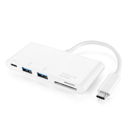
The adapter I had to buy in order to access the pictures
Once the adapter is delivered I will have to move the pictures from the SD card to a flash drive in order to give them to my group members and access them on the school computers. We will most likely be able to do this on Monday. In order to do this, however, I will probably have to bring in my laptop and the new adapter to school. Being unable to extract the pictures for three days has been a set back, but we have found other things to work on while waiting.
The adapter I had to buy in order to access the pictures
Prop Decision Explained
For my photo shoot I made many conscious decisions on what I wanted my model to wear. I had my model wear an Off White hoodie for the top. The reason I had him wear this is because Off White is a very well known brand. It is a brand similar to Gucci and Supreme in the sense that their supply is very limited. This leads their products to typically be very expensive. The reason I wanted him to be in knowingly expensive clothing was to emphasize the point that he was a successful rapper. The every expensive clothing shows that he has a lot of money and conveys the sense of extravagance and wealth. In all of the photos I took of my model I had him wear this hoodie in order to convey these points.
Another prop used in some photos was a gold chain provided by one of my group members. I did not have my model wear this in all of the pictures taken because the chain seemed a bit over the top. When going for the idea that he was successful and wealthy, I did not want to go for the idea that he was also very arrogant. With the inclusion of the chain it would have seemed too much like he was trying to brag to the readers rather than just simply show his success. I did have him wear it in some of the pictures just in case I wanted to go with an overwhelming sense of wealth to really emphasize the point I was trying to make. My model also drew on face tattoos with a sharpie for the photo shoot. The reason I had him do this was because it is something that is becoming very common of rappers now. Face tattoos essentially have been a sign of dedication to modern rappers to their music. They decide to get face tattoos because once they get them they use this as motivation since they would no longer be able to get a normal job. I had my model include face tattoos to show his dedication.


Another prop used in some photos was a gold chain provided by one of my group members. I did not have my model wear this in all of the pictures taken because the chain seemed a bit over the top. When going for the idea that he was successful and wealthy, I did not want to go for the idea that he was also very arrogant. With the inclusion of the chain it would have seemed too much like he was trying to brag to the readers rather than just simply show his success. I did have him wear it in some of the pictures just in case I wanted to go with an overwhelming sense of wealth to really emphasize the point I was trying to make. My model also drew on face tattoos with a sharpie for the photo shoot. The reason I had him do this was because it is something that is becoming very common of rappers now. Face tattoos essentially have been a sign of dedication to modern rappers to their music. They decide to get face tattoos because once they get them they use this as motivation since they would no longer be able to get a normal job. I had my model include face tattoos to show his dedication.


I had my Model Wear an Off-White hoodie along with a chain and face tattoos.
Wednesday, November 13, 2019
Photo Shoot
Yesterday me and my group members went to take pictures. We decided to go to one of our group members homes to take the pictures. We decided to go here because he has a very large piece of land with many places to potentially take pictures. We each used each other as models and each of us used a different model. We all took pictures individual to what we wanted our magazines to look like. I used my group member Matthew as a model. I found any different places to take pictures of him for the magazine. I decided to take many pictures that represented him and his extravagance. I took pictures that represented that he was essentially 'on top.' My pictures represented success and wealth which is what I wanted to capture in order to show that this rapper is beginning to blow up.
In all of the pictures I took of my model I had him look very intimidating and serious. I wanted to capture a very dangerous and reckless tone in my model. This look signifies rap music and what it is. The music itself tends to be very reckless and dangerous music and caution is thrown to the wind. I wanted my model to embody this and show that he is capable of making this kind of music. I essentially wanted him to look the part. This increases his validity as a potential new artist to readers, and earns him and my magazine respect from readers.


In all of the pictures I took of my model I had him look very intimidating and serious. I wanted to capture a very dangerous and reckless tone in my model. This look signifies rap music and what it is. The music itself tends to be very reckless and dangerous music and caution is thrown to the wind. I wanted my model to embody this and show that he is capable of making this kind of music. I essentially wanted him to look the part. This increases his validity as a potential new artist to readers, and earns him and my magazine respect from readers.


All of these are photos of me taking pictures of my model
Tuesday, November 12, 2019
Further Complications and Planning
Yesterday me and a group member tried to go to Goodwill to get necessary props for our photo shoot. After the gym we planned on going to a nearby Goodwill. We found out however that upon researching their hours it was only a book store. We tried another Goodwill that was also very close and when we got there we realized it was only a donation center. Due to this, we were not able to go to Goodwill yesterday and buy anything because by the time we had done all of that it was too late to try and go somewhere else. We decided that we would go home and simply use what we had at all of our homes for our photo shoot. Today we are all going home to get our necessary materials and then meeting up after school to take pictures.
We made these plans by communicating on the app Snapchat. We created a group chat on this app last week so we could communicate outside of school. The group chat has proved very helpful in helping us to communicate and make plans for meet ups. We have planned to meet at a group members house today, November 12th, after school at 3:30. The reason we cannot go right after school gets out is because we all have to first go and get all of the necessary materials for the photo shoot from our homes.

We made these plans by communicating on the app Snapchat. We created a group chat on this app last week so we could communicate outside of school. The group chat has proved very helpful in helping us to communicate and make plans for meet ups. We have planned to meet at a group members house today, November 12th, after school at 3:30. The reason we cannot go right after school gets out is because we all have to first go and get all of the necessary materials for the photo shoot from our homes.

The Snapchat group chat we created to communicate
Monday, November 11, 2019
Scheduling Issues
We were supposed to take pictures Friday, November 8th, but ran into complications on why we could not. On Friday one of our group members had band practice and could no longer take pictures after school. This complicated us because we had to reschedule. Since we were planning on taking pictures over the weekend now we could not communicate in school to make plans. To combat this, we created a group chat on the app Snapchat. This gave us a way of communicating outside of school. Using this, we made plans to take pictures on Sunday morning, but yet again our plans were unsuccessful. One of our group members made other plans for Sunday morning and we could no longer take pictures this day. We now have plans to take pictures after school on Tuesday, November 12th. The reason we are taking pictures on this day is because it s the only day our group member does not have band practice.
We also realized this weekend that we did not have all of the necessary props to take the pictures. What we decided to do today is go to Goodwill in order to buy what we needed. We are going to buy the clothing we need to wear in the photos and other things that may help enhance our pictures. My group member and I often go to the gym together so we decided it would just be convenient to go after the gym today.
Thursday, November 7, 2019
Research for Photo Shoot
Today we did research to further plan out what we would be doing in our photo shoot. We wanted to focus our research on what rappers wore, how they typically posed, the faces they made in pictures, and other aspects of how they acted in photos. Through looking up pictures of many popular rappers I found a lot of valuable trends in the way they dressed. Typically rappers dress in very expensive clothing. They wear things such as fur coats that are very clearly expensive. They also wear a lot of designer clothes and wear big brand names such as Gucci, and Supreme. There are other rappers though, such as Jay Z, who do not dress as extravagantly. Jay Z dresses very casually and typically only wears a t-shirt and jeans. What I have to decide is what I want my model to reflect. I have to decide if I want my model to follow the trends set by rappers wearing extravagant clothing, or if I want him to dress humbly. Two common themes between both though, are that in most pictures a lot of the popular rappers are wearing hats, and expensive chains.
The rappers in most of their pictures tend to have very serious faces. They often give off a very intimidating look. This is something I will try to achieve with my model in order to replicate the rapper feel. Also, the rappers tend to have very basic poses when being photographed. I found that there are not really any common poses in the pictures I looked at. The only common actions in he pictures were pictures of them performing. I have not yet decided if I want my cover photo to be an action shot or just a still picture.


The rappers in most of their pictures tend to have very serious faces. They often give off a very intimidating look. This is something I will try to achieve with my model in order to replicate the rapper feel. Also, the rappers tend to have very basic poses when being photographed. I found that there are not really any common poses in the pictures I looked at. The only common actions in he pictures were pictures of them performing. I have not yet decided if I want my cover photo to be an action shot or just a still picture.

Jay Z in very casual attire at his show

Kodak Black wearing a very expensive fur coat
Wednesday, November 6, 2019
Photo shoot Planning
Today we planned our photo shoots to get the pictures for our magazines. We decided a good day to meet up and take the pictures that worked with all of our schedules. We decided to take the pictures Friday after school since this is the only day we are all free. We are not quite sure where exactly we want all of our different photos to be, and were going to decide that once we meet up. The only criteria for my picture that I want for my cover, is that I would like a very dark background behind my model. We've decided we are going to meet up at one of our group member's house to take the pictures, since he lives on a very large property, and there is a lot of good spots there to take pictures.
We still need to get props and things for the photo shoot and we are trying to decide what exactly we need and when we will get them. The props we need are baggy clothes, extravagant clothes such as fur coats, or very nice jackets, chains, and other things that are typical for rappers to wear. We need to do further research on typical wear for rappers before our photo shoot so we can know exactly what we want to wear in our pictures.
We still need to get props and things for the photo shoot and we are trying to decide what exactly we need and when we will get them. The props we need are baggy clothes, extravagant clothes such as fur coats, or very nice jackets, chains, and other things that are typical for rappers to wear. We need to do further research on typical wear for rappers before our photo shoot so we can know exactly what we want to wear in our pictures.
Tuesday, November 5, 2019
Research
Today I researched other hip hop magazines in order to learn common themes between them. I looked for language used in the puffs and titles and looked to what kind of language was used. In most of the magazines the language is very informal and some use well known slang in titles and captions. One big common design theme is almost every hip hop magazine contains a lot of red on the cover. This was a factor in our decision to make the font color red on our magazine cover. Another thing that was common of hip hop magazines is in the picture of the model on the cover they always have a very serious face. The models are made to look almost intimidating to the reader and give off a very serious tone.
We also looked at the other hip hop magazines for conventions. We looked at things such as anchorage, and where they placed certain things on their cover. The magazines almost always have a picture of a certain artists, and the largest piece of text on the cover is the artist's name. In the banner the magazines included either one of that main articles in the magazine or their slogan if they had one. In the sweet spot on the cover the magazines almost always had the title of their main article there. This research helped to make us begin to think about how we would use certain conventions in our magazine,


We also looked at the other hip hop magazines for conventions. We looked at things such as anchorage, and where they placed certain things on their cover. The magazines almost always have a picture of a certain artists, and the largest piece of text on the cover is the artist's name. In the banner the magazines included either one of that main articles in the magazine or their slogan if they had one. In the sweet spot on the cover the magazines almost always had the title of their main article there. This research helped to make us begin to think about how we would use certain conventions in our magazine,


Monday, November 4, 2019
Font
Today we choose what font we would use for the title of our magazine and what color it would be. We choose the font type we wanted to use was Adumu Regular. We choose this font type because it is a very distinct font. It is also a very bold font so it really stands out as a font for a title. The letters are very structured and we believe this font is very good for a hip hop magazine. It follows the pattern of other hip hop magazines as most use very distinct and bold letters to make their magazines stand out.
We have also decided that we want the color of the font to be red. We researched what specific colors meant and what emotions they evoked. We also researched other hip hop magazines to see what colors were predominantly used. Red was a very common color throughout the other magazines and we also found that red evoked a feeling of danger which was good for the dangerous nature of hip hop. Red is also the most eye catching color.

We have also decided that we want the color of the font to be red. We researched what specific colors meant and what emotions they evoked. We also researched other hip hop magazines to see what colors were predominantly used. Red was a very common color throughout the other magazines and we also found that red evoked a feeling of danger which was good for the dangerous nature of hip hop. Red is also the most eye catching color.

The research done about the color psychology
Photography
Today we discussed what pictures we would be using for our magazines. We have decided that we want to use each other as models. We are going to pose as new rappers and photograph ourselves. We are still trying to figure out where exactly we want to take our photos but have a general idea of what we want them to be of. For my cover the general idea that I have is I want a medium close up shot of one of my group members with a dark background behind the. I want the background to be very plain so the main focus is the person. The person will be dressed in clothes that are typical of rappers, such as baggy clothing, or very extravagant clothing, and chains.
I want my cover to be a photo like this so it will relate to my story. The model in the picture will be the up and coming artist that I will be writing about in the magazine. I want them to be dressed like a rapper would in order to appeal further to hip hop fans, so they will know my magazine is a hip hop magazine at first glance. The plain background will make sure the focus is on the model, who will be the focus of the magazine. I want the background of the photo to be dark so that the writing on the cover really stands out more. Also, if we follow the trend f red font, it would really stand out on a black background.
Thursday, October 31, 2019
Technology and Font
Yesterday we decided to explore the software we would be using to create our magazine. We decided we would use Canva since it is a free software and it is capable of making a very professional looking magazine. We spent the day learning the specifics of the software and how to use it. We each drafted a very basic cover just to learn how to do certain things. We learned how to insert pictures and text boxes, how to change font sizes, color, and type, and we learned many other things about the software. For the drafts we created we just used online pictures and not pictures we took, and made it a very simple cover. The only point of the draft was to learn how to use Canva.
After making a draft we discussed what we wanted our font to be. We researched other hip hop magazines and looked at the font types they used to get an idea of what we would utilize. A common theme for hip hop magazines were they used very bold and distinct fonts for their title. We decided we wanted to follow this trend and pick a font that had very distinct and bold letters that stand out on a magazine cover. We have not yet decided the exact font we would want to use, but we have a general idea of what we are looking for now.

This is the draft I created on canva
Tuesday, October 29, 2019
Preliminary Exercises
Several preliminary exercises were completed before beginning this project. One activity we did was mark up the covers of magazines in order to learn the conventions of a magazine cover. We learned the aspects such as sweet spots, mast heads, puffs, etc.This activity helped us to learn the setup of a magazine cover and the aspects involved in making our own magazine cover. It helped in learning the purpose of all of the different conventions on a cover and to see what each specific piece was meant to do. We labeled several covers to fully understand the conventions of a magazine cover as well as what magazines use to make themselves stand out. We learned about the house style that magazines use to make themselves unique as well as the ode of address they use.
We used the first activities to complete our next preliminary exercise. We used what we learned about the conventions of magazine covers and applied it to creating our own magazine cover. We created a hip hop magazine titled "Music Monthly." We made this magazine where everything but the photo was hand drawn. We used our own house style and mode of address to make our magazine unique, and put into use all of the conventions we learned about from the previous activities into use. We utilized puffs, incentives, buzz words, a slogan, and many more conventions. This project was our first experience creating a magazine cover and it taught us how to approach making one in the future.

Annotated magazine for conventions

The preliminary magazine cover we created
Monday, October 28, 2019
Genre Research Continued
Today we continued to research the specific genres of hip hop music. The two that continued to stand out to us were gangsta rap and trap. The decision we were making was if we wanted to focus on up and coming artists in a specific sub genre of hip hop or just the hip hop industry overall. Ultimately we made the decision that focusing on the hip hop industry overall rather than a specific genre would be more beneficial for us. While gangsta rap and trap music were appealing topics to write about we made the decision that focusing specifically on one of these genres our magazine would have been too limited.
The decision that we made was that if we focused on a specific genre then our audience for our magazine would be limited to only fans of that genre. If we focused on the overall hip hop industry however, our audience would be much larger, and our magazine would be appealing to many more people. In our research we looked at the popular artists for each genre and found out that not many genres had several very popular artists. What this showed us is that artists are a very wide variety of genres and it would have been very difficult to find many up and coming artists in such a specific genre. So, focusing on hip hop overall was beneficial for our content as well as the size of out audience. In the end we decided our genre would be up and coming artists in the hip hop industry.

This is a screenshot of the page we used to research the specific genres.
Thursday, October 24, 2019
Genre Research
To find a specific genre to focus our magazine on we began by researching specific styles of hip hop. We knew we wanted to produce a hip hop magazine, but were unsure on exactly what it would be. We were not yet sure if we wanted to focus on a specific genre of hip hop or possibly a specific are in hip hop. If we decided to focus in on a specific style of hip hop we knew we wanted it to be a harder style. We began to research the specific style and some that stood out to us included, trap music, and gangsta rap. We did decide that our magazine would be focused primarily on up and coming artists in the rap industry, what we discussed today is if we would focus on up and coming rap artists in the overall rap industry, or in a specific style of hip hop.
The idea to focus on only up and coming artists for our magazine was inspired by the XXL magazine's freshman edition. Every year, this is typically XXL's most popular edition of their magazine, showing how wildly popular the idea of new artists is. Since the edition is so popular, we decided we would make a magazine dedicated to this topic, since XXL is the only magazine that does this and they only do it once a year. There is not much competition for this style of hip hop magazine and it has proved to be successful in the past.
Now that we had a specific area of hip hop that we wanted to focus on, we had to decide if we wanted to focus on a specific genre of hip hop or stay in the overall genre of hip hop. We continued to research the specific genres, but were unable to reach a decision on what we would do.

XXL Freshman Edition
Wednesday, October 23, 2019
Magazine Title Revision
After further discussion we have decided against the title of caution. When we thought further into what the title meant to a potential reader we decided that caution did not convey the meaning we intended. The word caution, rather than convey a hardcore meaning to compliment the music covered in our magazine, goes against the purpose of hip-hop music. Hip-Hop artists tend to not use caution when writing their music and tend to sway on the risky side with their lyrics. They include sensitive topics in their music and tend to use very graphic language. This all goes against the idea of caution. This is why we decided to scrap this title. We originally believed that the title of caution would convey a sense of warning to the potential reader and give them the idea that what was inside was risky potentially graphic content, but the title did the exact opposite.
We now have two new ideas for a title: The Come Up and Reckless. The first title idea conveys the idea that our magazine will focus on only up and coming rappers. The title will show the reader what to expect when reading our magazine. We have decided that we do only want to focus on only up and coming rappers since there are not many other magazines on the market that do this. The title Reckless conveys the original message we were trying to convey. It shows the defiant atmosphere of hip-hop music.
In the end we decided to go with the title The Come Up. We decided that this title fits not only the rap world, as coming up is a phrase often used when discussing new rappers, but gives the reader a great idea on what they will find in our magazine. It is a title that is not too long, yet not too dull. It is a great lengths and it is very eye catching.
Magazine Title
Today, we discussed what we would title our magazine. We have decided that we want to create a hip-hop magazine, but have not yet decided on a more specific genre. We have decided that we do not want our title to be too long so it is a catchy trendy title. Too long of a title would turn away potential readers. Our target audience for a hip-hop magazines would be those a part of the younger demographics. Knowing that this demographic tends to have a shorter attention span we want to keep our title shorter to tend to this younger audience.
We tried to come up with a short catchy title that conveyed the sense of toughness. We know that hip-hop can tend to be very hardcore music and wanted to create a title that would reflect this. Trying to find words that could be potential titles we were thinking along the lines of words such as tough, and solid. We used a thesaurus to find words similar to these so we could find the right one for our title. After considering many titles we finally decided our title would be Caution. This title reflects the hardcore nature of hip-hop music. The word caution is often used to warn when something serious has occurred. We have used it in this sense to show readers that serious material is included in our magazine. This tile also would entice potential readers to purchase our magazine as the word caution creates a sense of ambiguity for potential readers, as they may wonder what it is we are cautioning them from.

Subscribe to:
Posts (Atom)